

My friend Anne's blog, Play Crafts has such lovely photographs and even a really user friendly palette builder. I was excited when she agreed to do a tutorial for us of tips for improving our pictures of quilts. I think you will really enjoy this tutorial, it will improve your photos, whether you take them with your phone or with a more fancy camera - read on.
First off, I want to thank Leanne for giving me the chance to share this tutorial with you all! There are a ton of useful photography tutorials out there, but I wanted to focus on a couple of things that you can do to improve your photos, regardless of what type of camera you use.
One quick caveat before we begin: photography is an art, which means that it's fairly subjective. You may not like the same types of photos I like, and that's totally okay! Hopefully I'll be able to give you enough knowledge that you can have more control over getting photos you like.

The thing I want to focus on today is light. Your photo is only going to be as good as your light, so it's an important thing to pay attention to! There's a lot you can do with software after the fact (my favorite is Adobe Lightroom followed by Adobe Photoshop) but you're best off starting with the best light you can.
So what's that look like? In a nutshell, you want indirect, full-spectrum light. I realize that might not be clear, so let's break down what that means.
Indirect Light vs Direct Light
Indirect light refers to a quality of light that produces soft shadows. This means the shadows aren't super dark, nor do they have hard edges. This is also referred to as soft light. The opposite of this is hard light or direct light.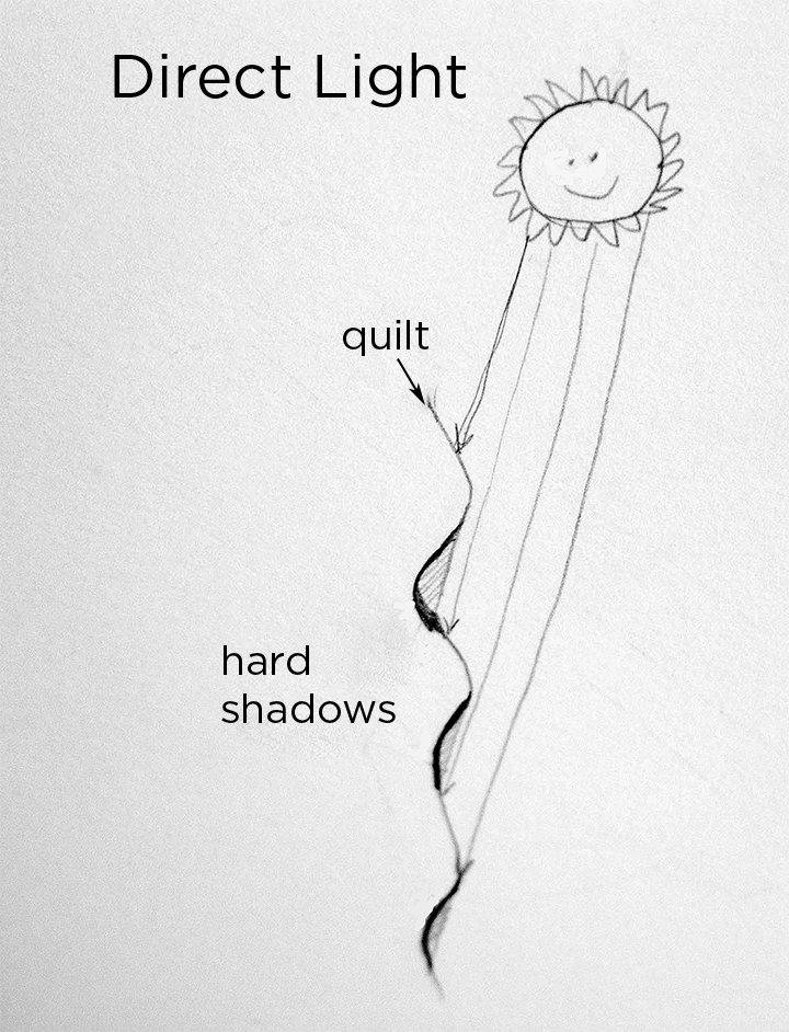
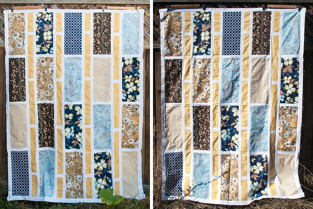
Direct light is light that is coming directly from the light source (the sun or a light bulb for instance) and therefore is all coming from one direction. This produces sharp shadow lines and really high contrast between the lit areas and the shadowed areas. Our eyes can adapt quickly to different light conditions, so we can see details when looking at the lit areas and when looking at the shadowed areas.
However, a photograph doesn't have the ability to show details in both areas at the same time. So when taking pictures of quilts in direct light, areas that are too bright for the camera to capture are white, and those that are too dark are black. This leads to a quilt not looking as colorful because more areas are bright or dark depending on if they're in direct light or shadowed.
Direct light does highlight the texture of the quilt well, although be aware that sometimes it is still too much contrast for our eye to be able to easily make sense of what's going on in the image. And in the case of quilt tops, sometimes you don't want to highlight the texture! (Look how much I needed to iron that quilt top in the first comparison image!)
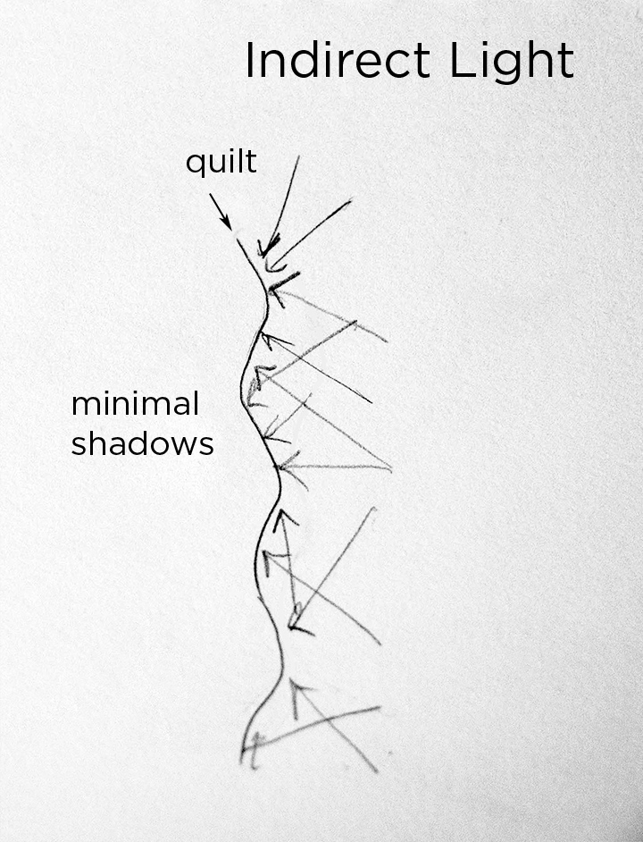
Indirect light on the other hand, means that the light has gone through a filter, or bounced off of something else. This means that the light is coming from multiple directions, each casting it's own shadow, which gives the shadows a softer edge. The shadows are also not as dark, and the highlights are not as bright since the light is hitting in different areas.

This reduces the contrast of the image which allows the camera to capture more of the details and retain more color.

To find indirect light, head to shaded areas, preferably near lit areas so you still get lots of light. The deeper the shade, the harder it will be for your camera to take a picture that isn't blurry since there's so little light. Be aware when taking photos in shade that you don't want any lit areas in the photo itself, as you'll get back to the high contrast problem. Dappled light looks pretty but is very difficult for a camera to capture, and a quilt in shade with a bright lit background can be difficult as well.
My favorite indirect light is overcast days. We get plenty of that in the morning where I live, and it keeps everything bright but super soft shadows. Just make sure the sky doesn't get in your image, because it will just look white or grey like in the image above.

Finally, if you're indoors, you can take a photo near a window. If there is direct light coming through the window, draw a sheer or curtain to filter or diffuse the light. This is similar to those white covers professional photographers put over their lights to keep harsh shadows out of their shots. If your curtains are super thick, then it will be too dark, but play with it and see what works best.
Overall, I find that soft light lowers the contrast so that the camera can capture the most range of color without adding too much visual chaos with the highlights and shadows.
Full-Spectrum Light
So now that we're aware of our highlights and shadows, it's time to think about the color of our light. Most light sources just look white, but they are often not. If you've ever been to a home improvement store, they often have light displays to show the "temperature" of the light source, and you can see some are more blue or more yellow.
Full-spectrum light refers to a light source that includes all the colors. (Remember, in light, all the colors = white which is why you see rainbows and why prisms work, because all those colors are there in sunlight.) Sunlight is the best source of full-spectrum light which is why you so often hear the adage to take your photos outside.

We see color because those are the colors of light reflected from an object. So something that is orange reflects orange light, something white reflects all light, and something black reflects no light. This means that if your light does not have all the colors in it at equal levels (so it is limited-spectrum), colors will not appear the same as if you had full-spectrum light. This is most obvious when dealing with light that is a complementary color to the object. A blue light (such as twilight) on an orange object will appear much more muddied.
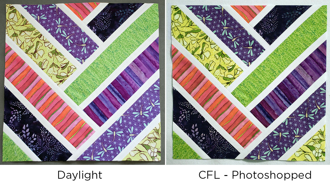
No amount of photoshopping can truly fix this since neither the camera nor photoshop can add the missing light where it belongs. Above, I took a picture of the same block in daylight and under a standard CFL (which has a yellow cast to it). I photoshopped the picture taken under the CFL to remove as much of the yellow cast (so the white looks white) and you can see the purples are still muddied (purple is complementary to yellow) and the greens and pinks have a more yellow cast to them.
Here's a series of photos I took using different light sources, using my Kona card to show the effects. These effects may seem subtle, but that's because the color area is so small, on a quilt it would be a lot more noticeable.
In each comparison, the top shows the untouched image, the middle shows the image photoshopped to get a true white, and the bottom is sunlight in indirect light.
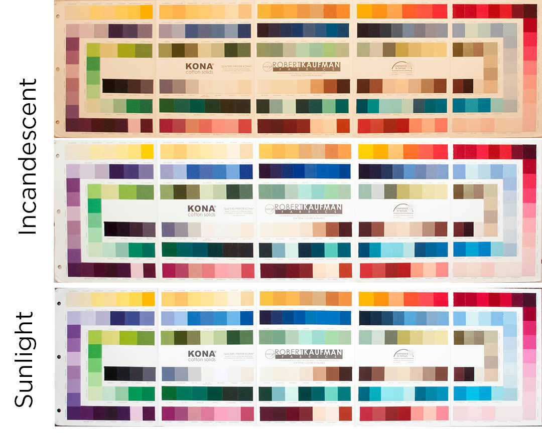
Incandescent light is yellow/orange, and so the purples and blues are a bit muddied, and the pinks went a bit orange.

Standard CFLs (Compact Florescent Lights) have a pretty strange light spectrum, but the major difference is in the olive greens. In sunlight, they tend towards brown, while under CFL they look a lot more green.
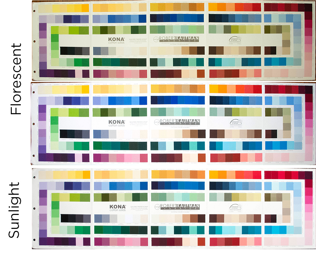
Florescent lights have a green cast (which is why people look so bad under it) and therefore the reds get muddied and the green/browns go more green, similar to the CFLs.

Shortly after the sun sets, there is some light still being reflected from the atmosphere. However, the color of the light has a strong blue/purple cast to it. The biggest difference in the twilight shots is that the oranges and yellow-oranges go redder, and the yellows get muddied.

Even outside, the colors will shift as the day progresses. Sunset is a wonderful time for taking landscape and portrait photos (it's often referred to as the golden hour because of the gold/red hues and because it lends such a warm tone to photos) but it can add a gold or red tone to your quilts which may be unwanted. I don't have a Kona color card picture, but above is a photo I took of Balanced Rock in Arches National Park, 30 minutes apart before and during sunset. You can see what a difference the light makes.
Conclusion
Here's a quick recap of the tips covered in this tutorial.
- Your photos will only ever be as good as the light you start with!
- Photos in indirect light will have more saturated colors and less contrast.
- Find bright shade, take advantage of an overcast day, or use a sheer curtained window for indirect light.
- Full-spectrum light gives you the most accurate colors.
- Sunlight is the best full-spectrum light.
- Even sunlight changes to limited-spectrum light during sunrise, sunset, and twilight.
- Photoshop cannot totally fix color issues caused by limited-spectrum light sources.
Hopefully you find this helpful, and it will help you with your photos in the future! If you have any questions, please feel free to ask!
And thanks again, Leanne!
Thank you Anne!
Don't forget to link up your Q1 finishes - the Q1 post-quarter link is open and it will close at midnight MST, April 7, 2013. And if you still have some UFOs I hope you will join us for Q2 of the FAL, Q2 FAL lists can be posted starting on April 8.
31 comments:
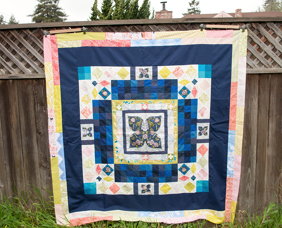
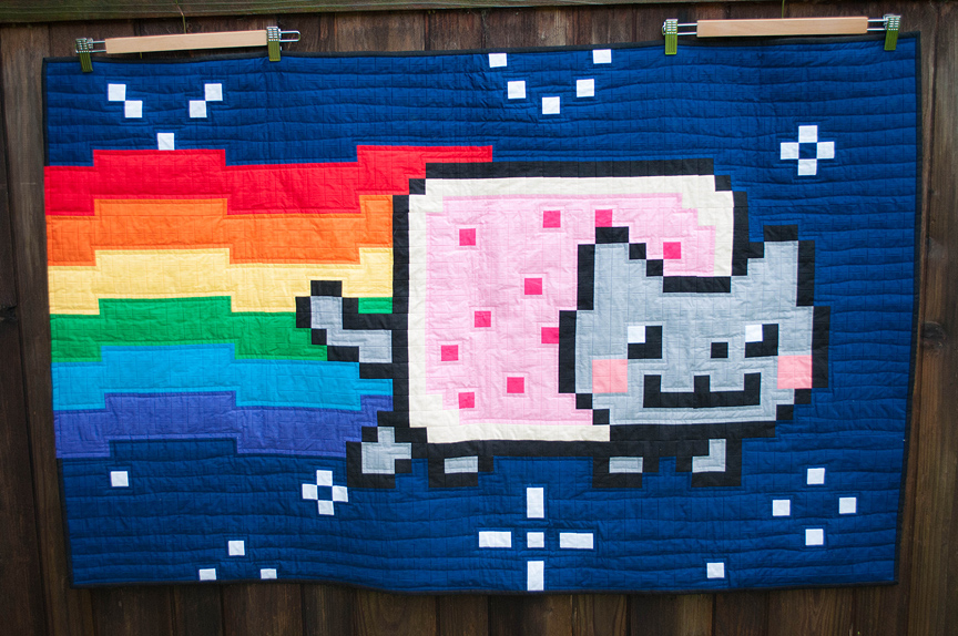
What a great post, thanks Anne and Leanne! Although I am most impressed with that Nyan cat quilt - my kid would LOVE that!!!
Fantastic post!! Thanks for all the tips!
Great post! Just did one on a book about taking better pictures for crafts - but the was nothing on quilting! This is a great complement!
Great post - must remember these tips!
fantastic info! Thank you :-D
Really useful tips - now if you could just sort our weather to not include rain or snow!!
Great post - thanks for the tips!
This is fantastic. I'm rubbish at taking phots so this should help loads
Excellent!
Great examples and information. Overcast days have their purpose I suppose!
This is such a fabulous post, thank you!
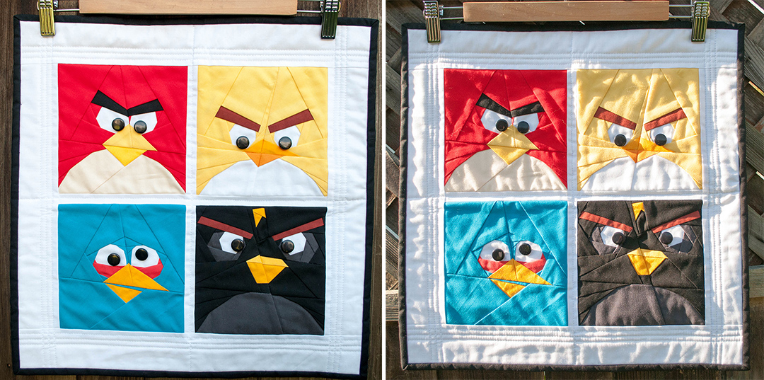
Thanks for all the tips! I love the angry birds quilt :-)
What an wonderful post! I think I will need to go back to this again and again - thank you Anne!
that was wonderfully put together, thank you!
Thanks so much for the thorough and helpful information - the examples really hit home and made it easy for me to understand the concepts. Now to apply them!
Thanks for taking the time to explain the science behind all these concepts. I am glad that Summer is on its way so there is SOME daylight to take photos!
Thank you for the explanation/tutorial... Honestly taking pics just isn't my thing, fortunately my husband loves it, so I try to get him to take pics once the project is actually finished.
Thank you, I think this will be most helpful. It's certainly a subject that we think about but usually don't hear about. Thanks.
Anne is awesome! She's full of talents. Leanne-so brilliant to have her here. I learned something about taking pictures! Thank you to both of you. Very well done!
Wow - this is terrific - thanks so much for all these tips!
Anne, youneed to do fncay picture with subject title for the header so I can pin this accurately :-D
Great tutorial!! Love the diagrams of direct v indirect light.
E xx
Thank you for all these tips!
THIS WAS AWESOME! I love the little sketches of a happy sun with a happy quilt. Your quilts are amazing, Anne.
This was great--someone actually talking about taking photos of quilts!!
I have to ask though, where did you get the pattern for the Angry Birds quilt?! My 5 yr old son LOVES them!!
Lots of good info, Thanks!
really well done. thank you!
Just the info in needed, thanks :-)
Hi
Thank you so much for providing such helpful information. This is really informative and I will for sure refer my friends the same. Thanks. <a href=" http://dandjstudio.com/”>photographers Seattle</a>
Great job with this article! It answered all my questions about photographing a quilt and more.
Fantastic article!
Your articles make whole sense of every topic.Heather Anne
Post a Comment